Screenshots
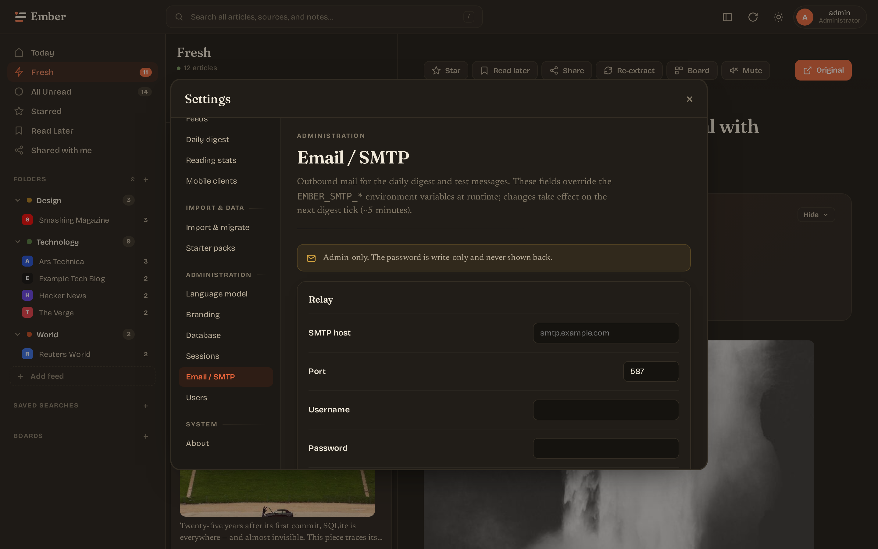
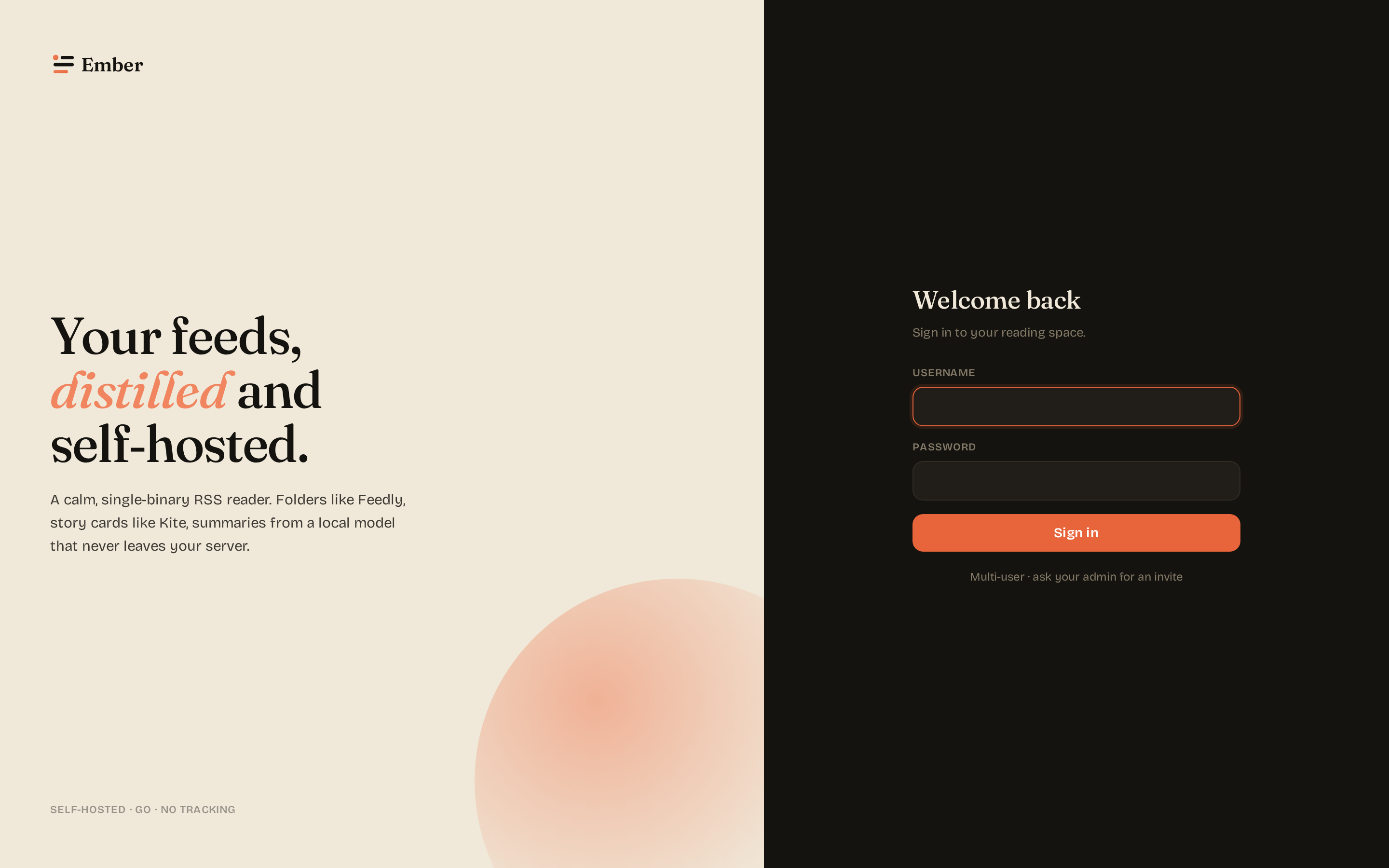
Captured against the test-mode binary via web/scripts/screenshots-dual-theme.mjs. Each scene is captured twice — once in the app's light theme, once in dark — at both desktop (1440×900 @ 2x) and mobile (390×844 @ 3x) viewports. The docs site shows the opposite variant — a light page displays the dark-theme capture and a dark page the light-theme capture (via the .light-only / .dark-only classes in the theme stylesheet) — so the screenshot contrasts the page background instead of blending into it.
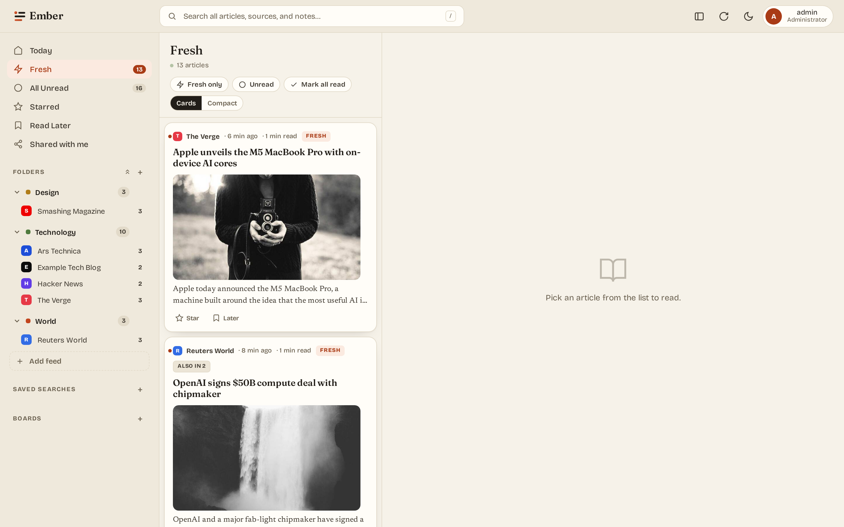
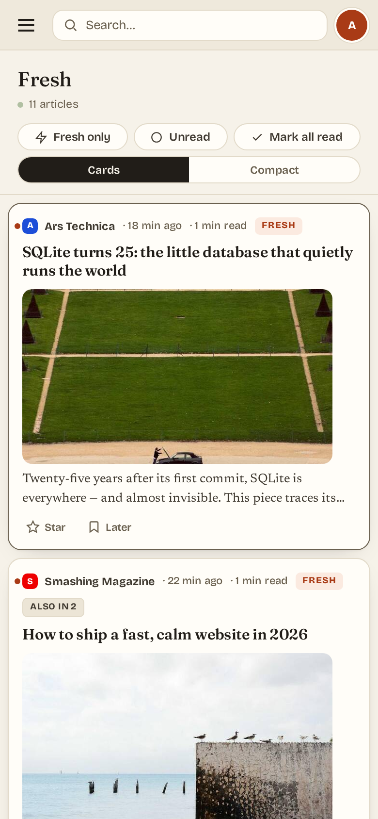
Three-pane reader
The default layout: sidebar of folders + feeds, the article list, and the reader. Keyboard navigation (j / k / r / m / s / ?), drag-to-reorder folders and feeds within them.
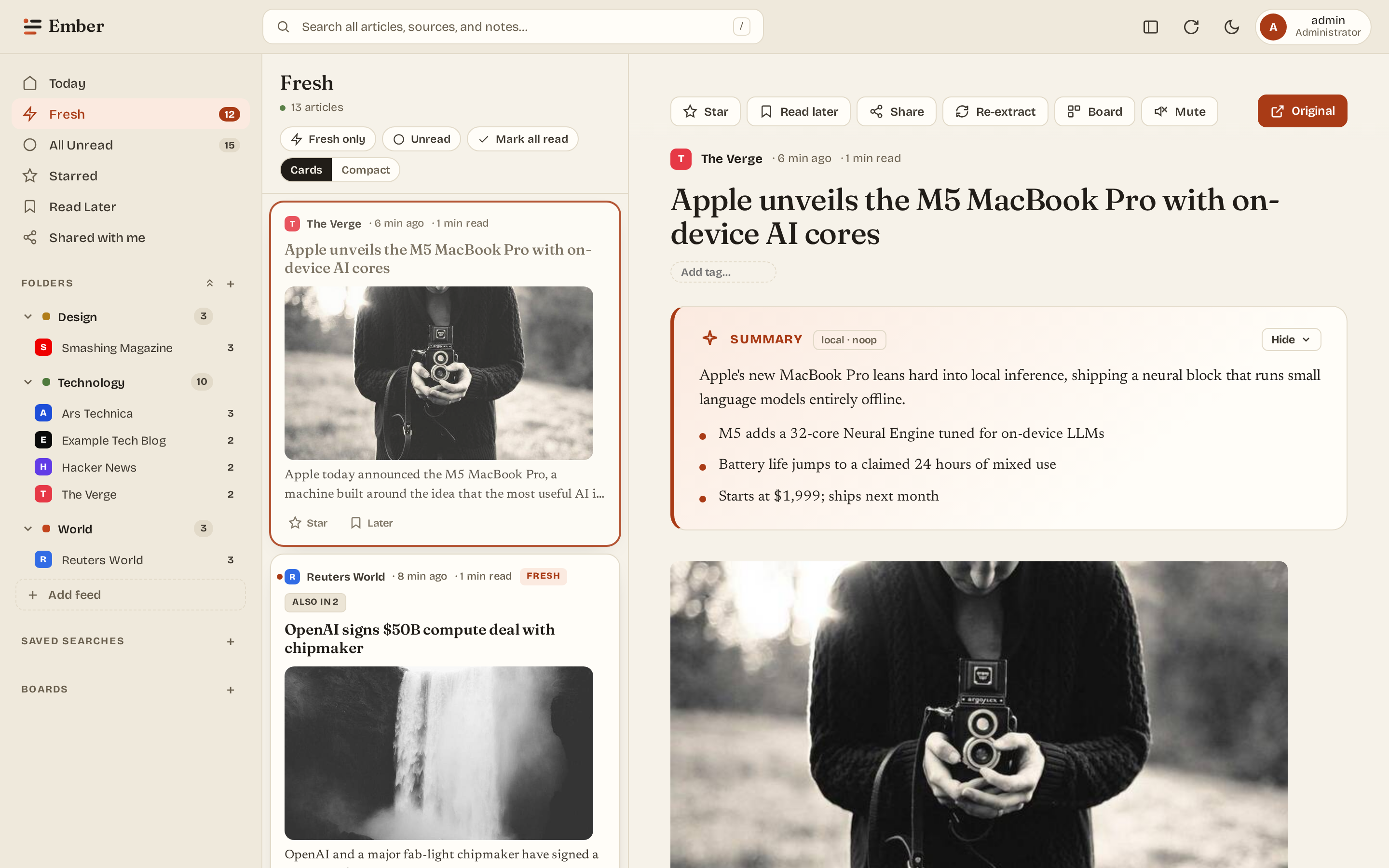
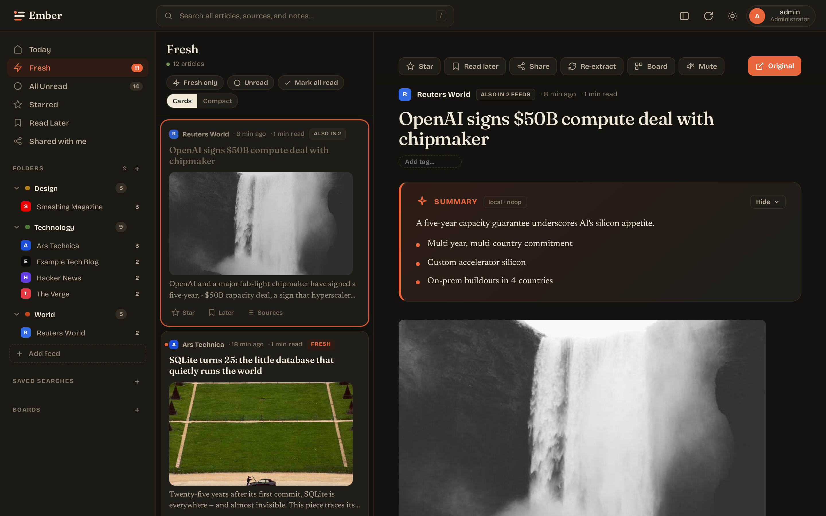
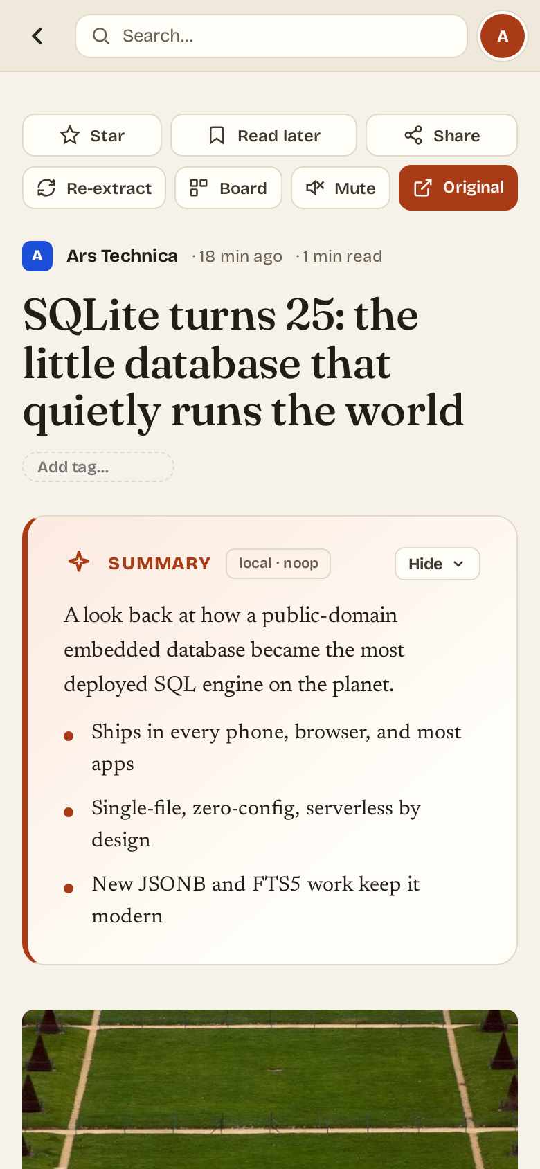
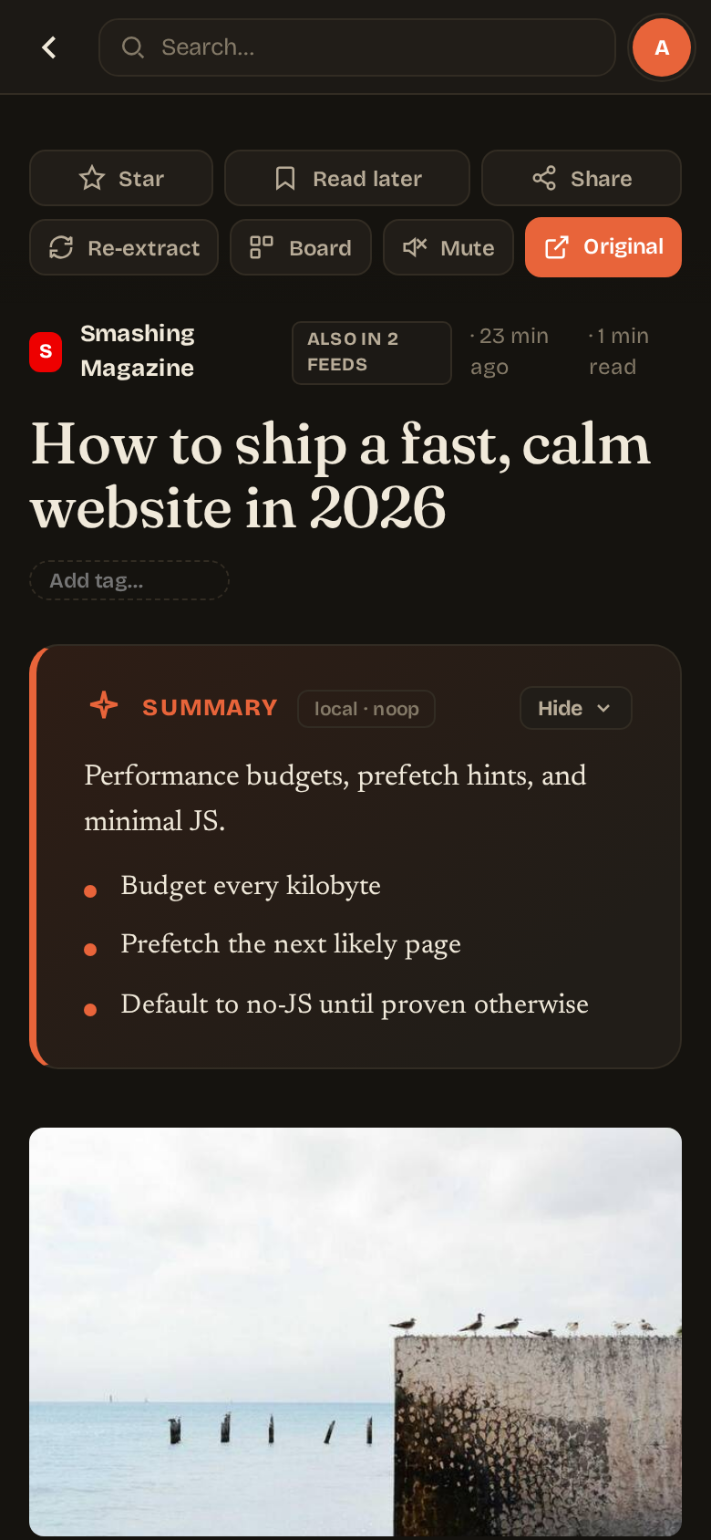
Article view
Summary card sits between the title and the body — paragraph lead + factual bullets. AI ad-stripping removes newsletter signups, podcast promos, and "Comments" trailers from the body before display.
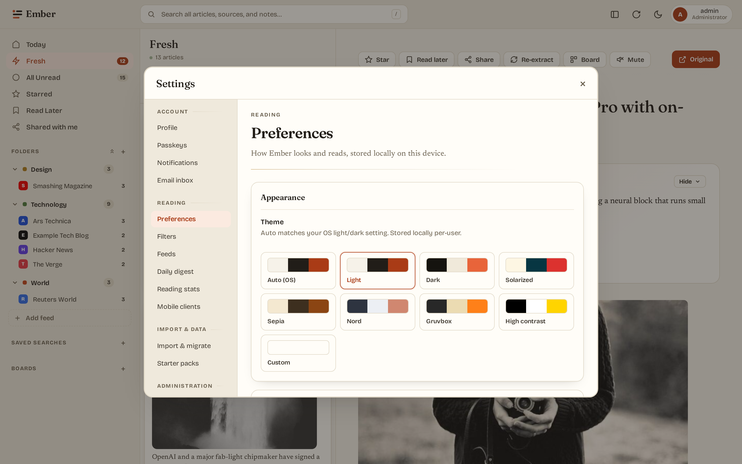
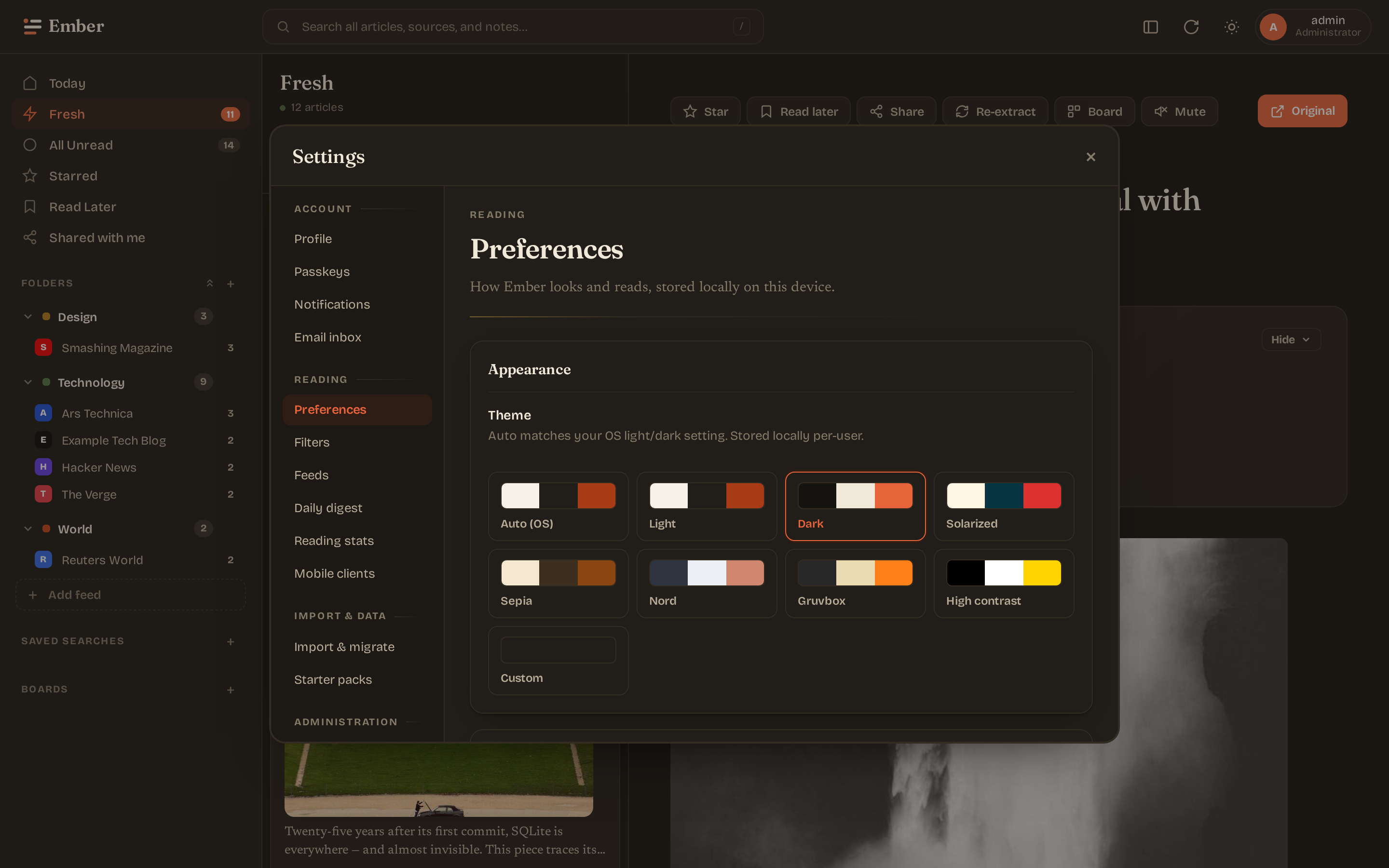
Settings — preferences
Theme picker (8 presets + custom palette), density toggle, AI summary card on/off.
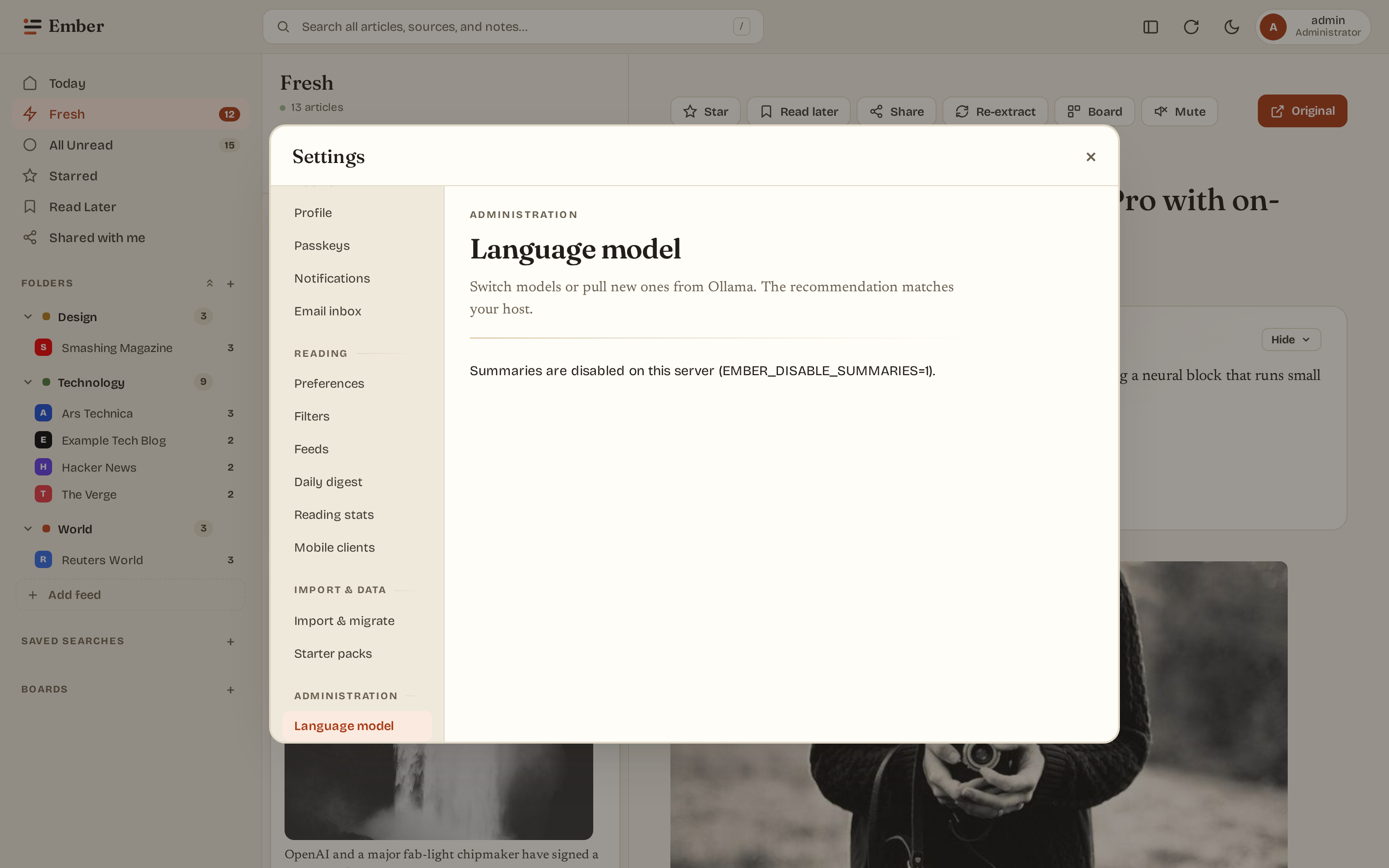
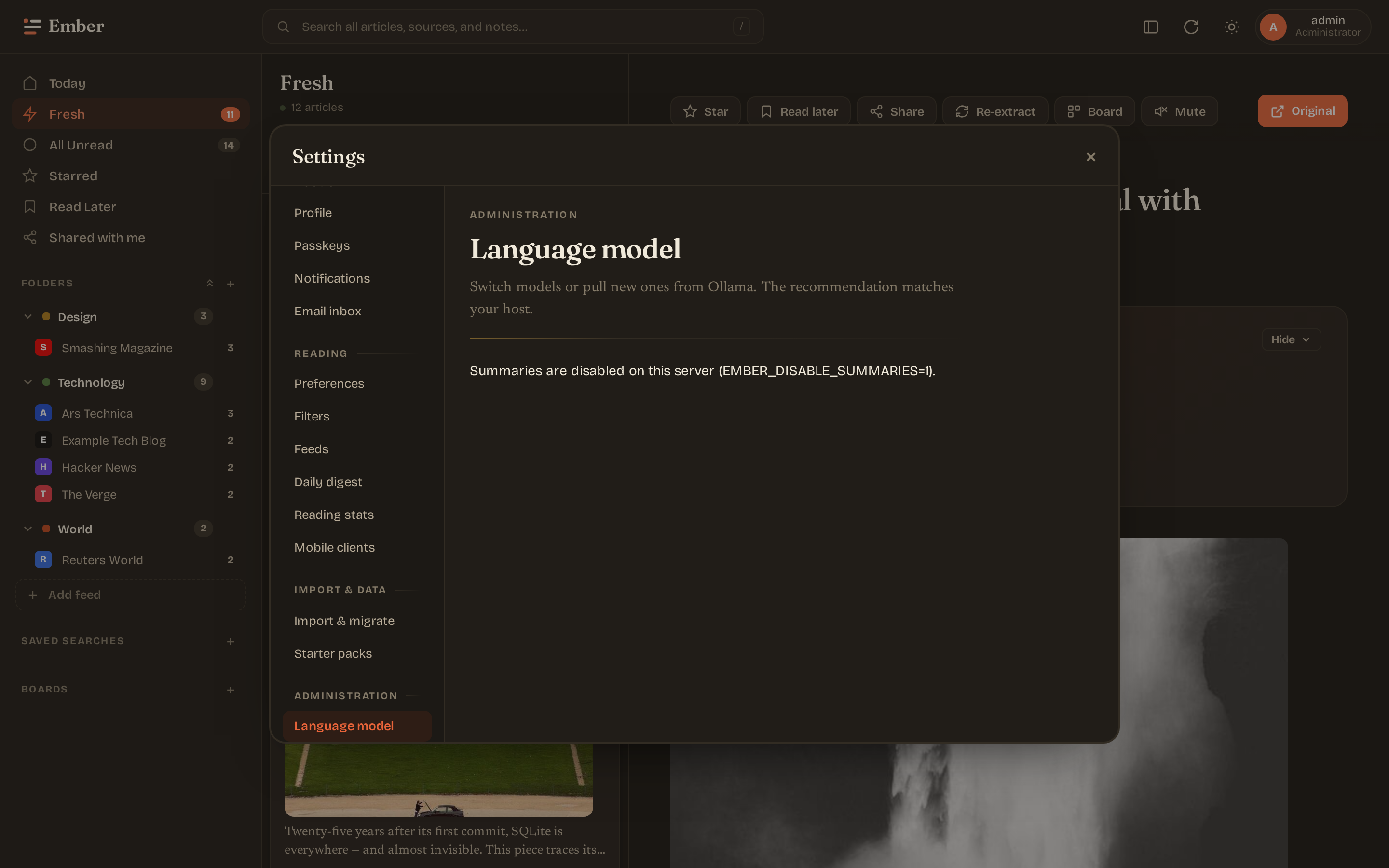
Settings — language model (admin)
Host probe (RAM/CPU/GPU) with a model recommendation. Installed-model table with per-row switch + delete. Pull form for new models. Sliders for temperature, top_p, num_ctx.
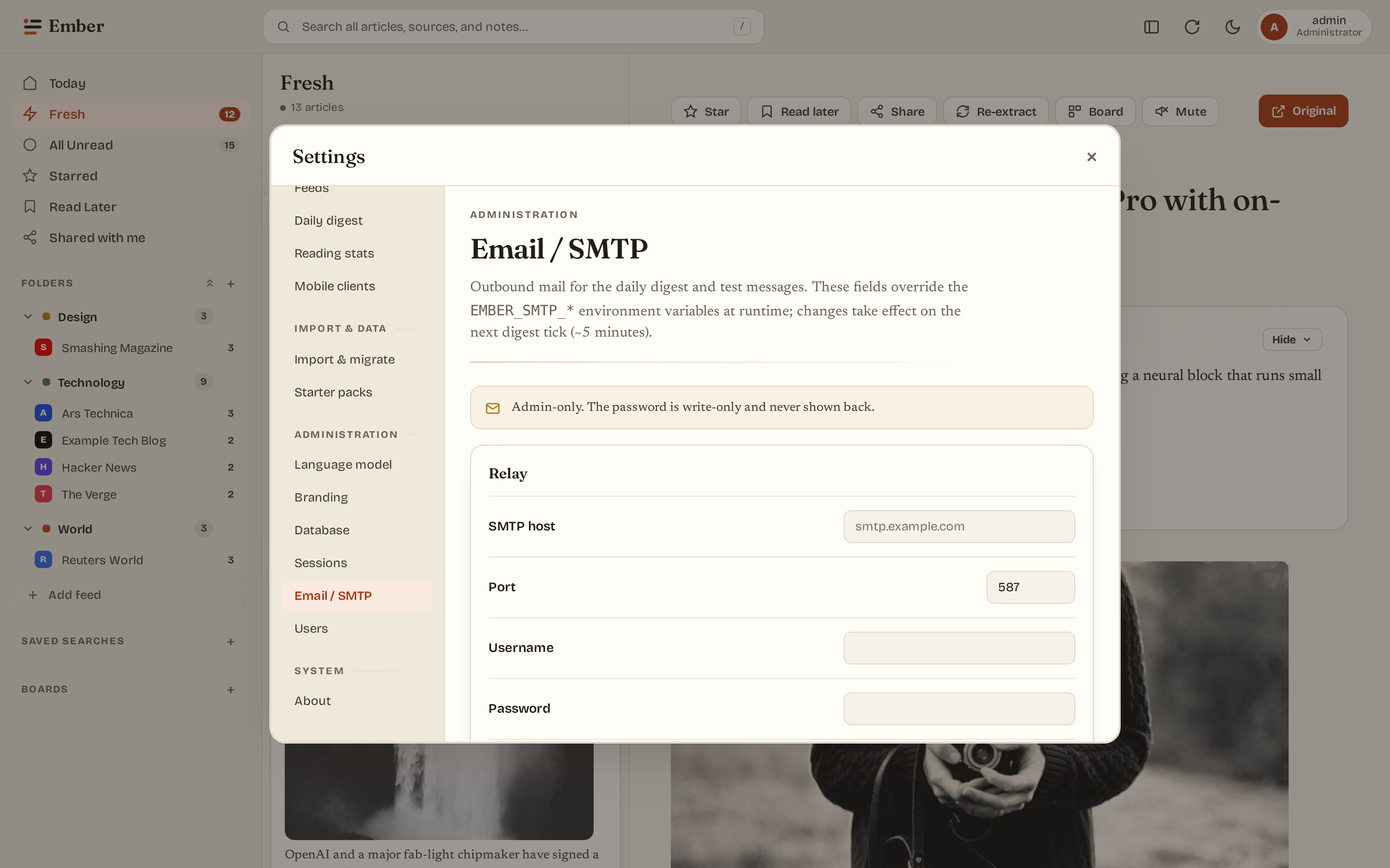
Settings — email / SMTP (admin)
Overlay the EMBER_SMTP_* env defaults with admin-edited values that take effect at runtime (digest sender re-resolves each tick). Send a one-off test email to verify the relay. Below it, the initial-backlog window controls how much history is ingested when a new feed is added.
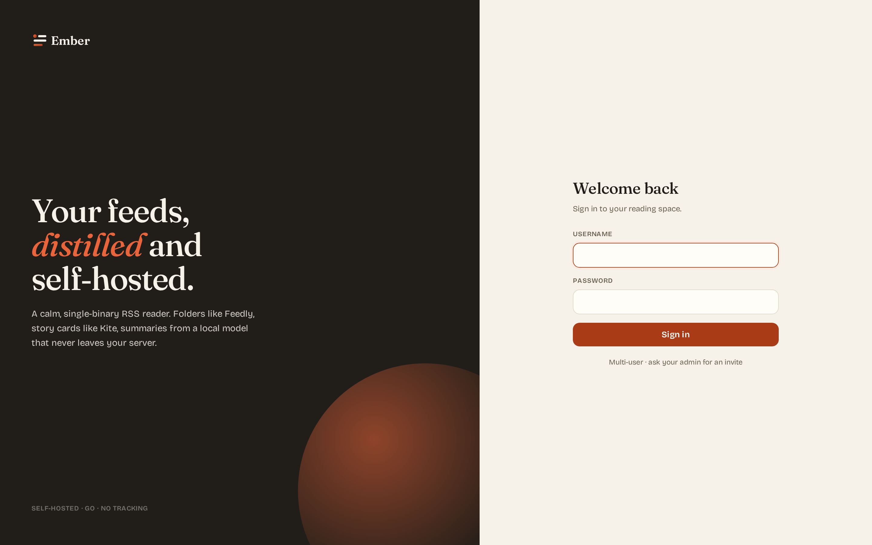
Login
Paper-and-ink split layout. Branding (app name, page title, favicon) is admin-configurable from Settings → Branding.
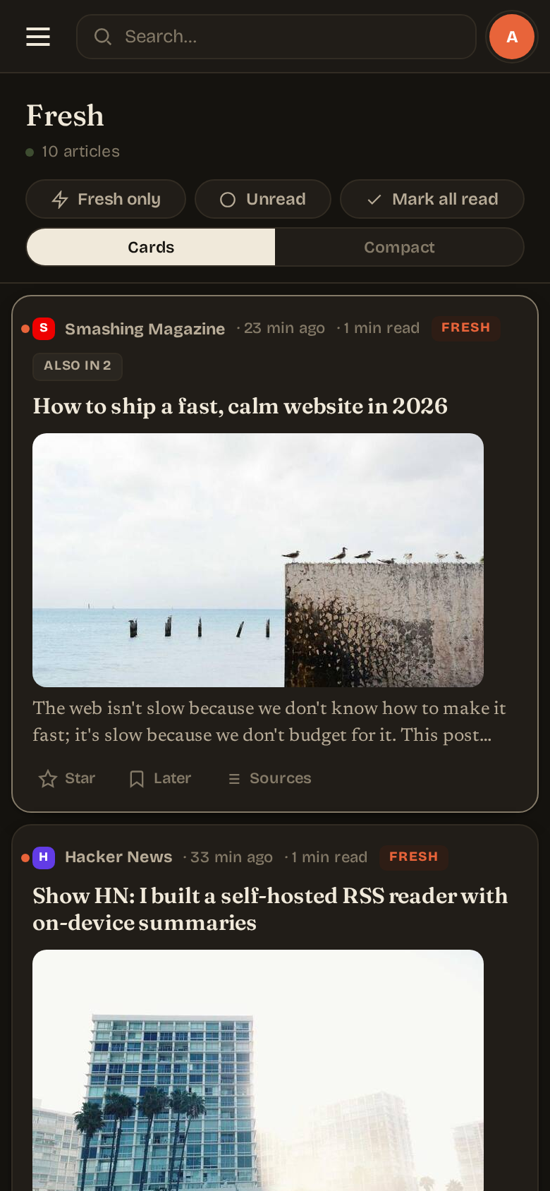
Mobile
≤900px viewport: sidebar collapses into an off-canvas drawer. Article list and reader take turns at full width — selecting an article switches to the reader; a back arrow returns to the list. Below 520px, the brand text hides so the search bar has room.
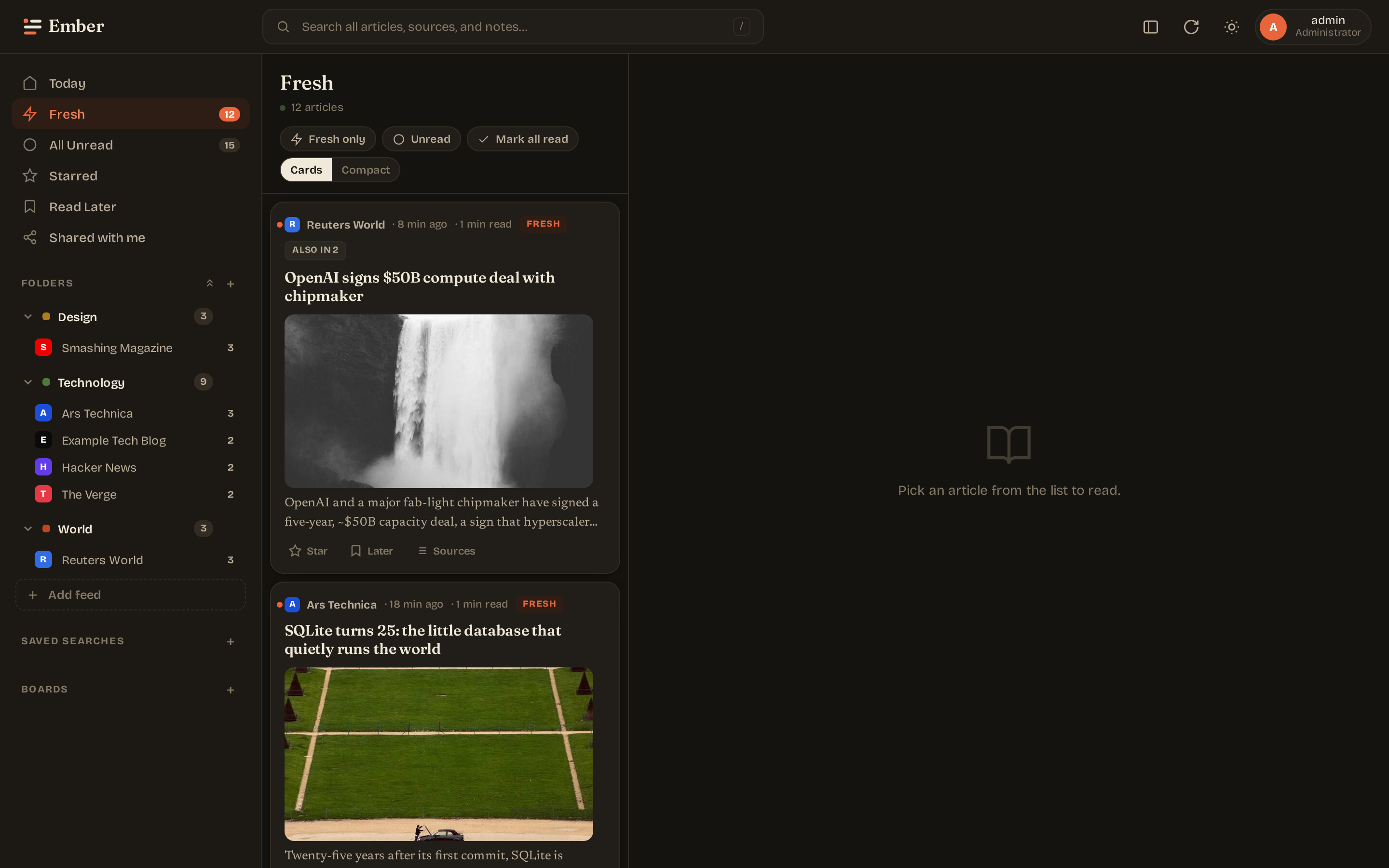
Themes
Eight presets cover light, dark, and accessibility needs. The "Custom" theme lets you pick 3 colors (paper, ink, accent) and the rest of the palette derives via CSS color-mix().
- Auto — follows the OS
prefers-color-scheme. - Light / Dark — paper-and-ink defaults.
- Solarized — Ethan Schoonover's classic palette.
- Sepia — warm browns, e-reader friendly.
- Nord — cool blue-gray dark.
- Gruvbox — warm-tinted dark by morhetz.
- High contrast — black / white / yellow for low-vision users.
- Custom — your three colors.
Regenerating these
make embed build
EMBER_TEST_MODE=1 EMBER_ADDR=:8083 EMBER_DB_PATH=/tmp/ember-shots.db EMBER_DISABLE_SUMMARIES=1 ./bin/ember &
node web/scripts/screenshots-dual-theme.mjs
kill %1
The script walks the test-mode binary through login → reader → article → each settings pane, captures both light and dark themes at two viewports, and writes PNGs into docs/public/screenshots/. Commit the result — it's the same as any docs change.